Oops! Something went wrong while submitting the form.
September 19, 2024
Google Analytics Plot Five Metrics
Google Analytics Update: New Visualization Tools, Anomaly Detection, and Revenue Tracking Enhancements
Highlights:
Compare up to five metrics side by side with enhanced data visualization.
Automatic anomaly detection flags unusual data patterns.
Progressed exchange detailing gives more point by point income insights.
Google has introduced a series of updates to Analytics, aimed at making data analysis more intuitive and insightful. Here's a breakdown of the key features and their impact on your workflow:
Key Features of the Update:
Compare up to five metrics side by side for a clearer view of your data.
A new tool now automatically detects unusual trends in your data.
The enhanced Transactions report provides a more detailed analysis of your revenue.
Acquisition reports now differentiate between user and session data more distinctly.
New descriptions make it simpler to understand the purpose of each report.
One of the standout additions is the "Plot Rows" tool, allowing you to visualize up to five different metrics at once for easy comparison. This feature helps you quickly analyze trends across multiple data sets, improving your decision-making process.
Anomaly Detection: Spotting Unusual Patterns
The new anomaly detection tool automatically flags unusual traffic patterns, highlighting unexpected changes in user behavior. This allows for quicker identification of potential issues or opportunities, giving you an edge in responding to market changes.
Improved Report Navigation & Understanding
Hover-over descriptions for report titles now provide clearer explanations, with direct links to detailed documentation, making it easier to navigate and understand each report.
Key Event Marking In Events Report
A new feature in the Events report lets you mark significant events, streamlining the process of tracking and prioritizing important data points. This feature is accessible via the three-dot menu next to each event.
New Transactions Report For Revenue Insights
The enhanced Transactions report is especially beneficial for ecommerce businesses, offering granular insights into individual transactions. This enables you to gain a more comprehensive insight into your revenue sources and sales trends.
Scope Refinements in Acquisition Reports:
The User Acquisition report now focuses on user-related metrics (Total Users, New Users, Returning Users), while the Traffic Acquisition report emphasizes session-related data (Sessions, Engaged Sessions, Sessions per Event), making it easier to track the metrics most relevant to your goals.
Next Steps:
As you investigate these modern highlights, keep in mind:
Familiarize yourself with the "Plot Lines" include for comparative information examination.
Keep an eye on anomaly detection alerts, but always investigate the context behind them.
Use the enhanced Transactions report to dive deeper into your revenue insights.
Explore the refined acquisition reports to focus on the metrics most useful to your analysis.
These updates are designed to enhance your data analysis capabilities, helping you make more informed decisions with greater ease.
FAQs:
1. What is the purpose of the 'Plot Rows' feature in Google Analytics?
The "Plot Rows" feature lets you visualize up to five rows of data in your reports, making it easier to compare metrics and analyze trends side by side.
2. How does the anomaly detection system work?
Google's anomaly detection automatically flags unusual patterns in your data, helping you spot unexpected trends such as sudden traffic spikes or drops.
3. What’s new in the Transactions report?
The enhanced Transactions report offers more detailed insights into individual sales, allowing ecommerce businesses to gain a better understanding of their revenue through transaction-level data.
4. How do I plot multiple metrics in Google Analytics?
To plot multiple metrics, use the 'Plot Rows' feature by selecting the metrics you want to compare, then click 'Plot Rows.' The selected metrics will appear on a single chart.
5. Can I compare different metrics on the same chart in Google Analytics?
Yes, the 'Plot Rows' feature allows you to compare up to five different metrics on the same chart, making it easier to identify relationships between them.
6. What are the benefits of plotting up to five metrics at once in Google Analytics?
Plotting five metrics simultaneously saves time, improves data visualization, and simplifies the analysis of how different metrics influence one another.
The world of SEO is constantly evolving, and in recent years, the biggest driving force behind this transformation has been AI and machine learning. These technologies are not only revolutionising how search engines function but also how SEO professionals optimise websites. If you're curious about how AI is shaping the future of SEO and what it means for businesses, you're in the right place.
The People Also Search For (PASF) feature in Google’s search results offers valuable insights into user behaviour by showing related queries that users may explore after their initial search. For SEO professionals, PASF is a valuable source of keywords and related terms that can help drive traffic and improve visibility.
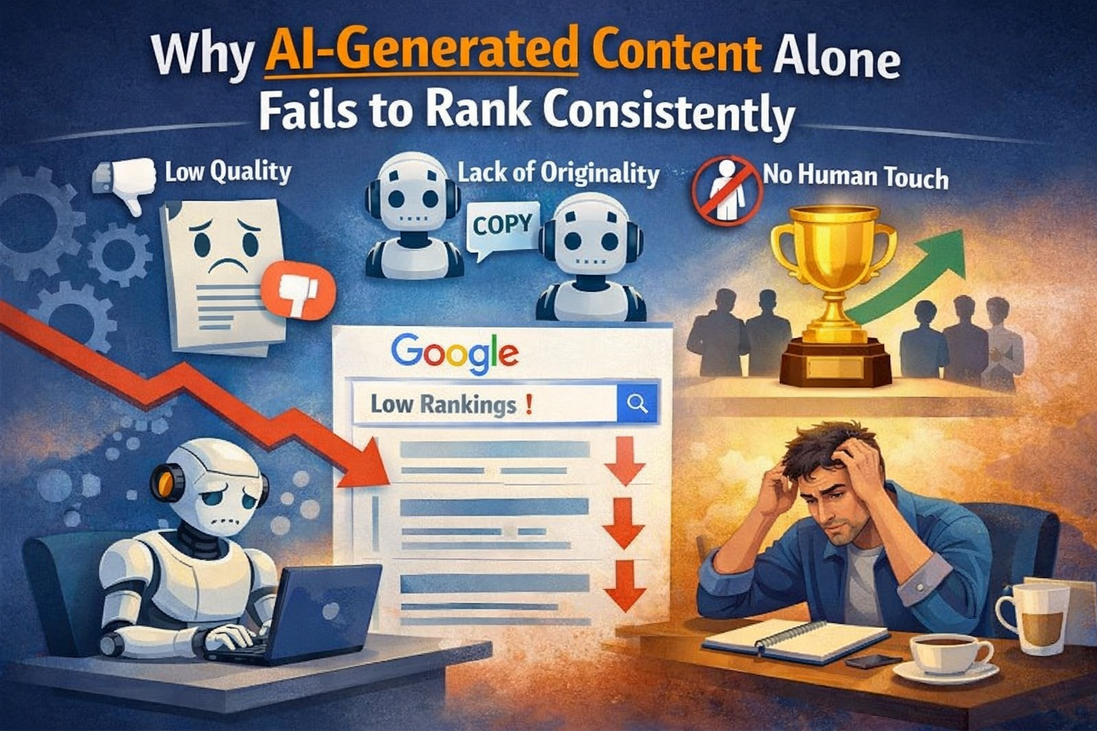
You published a batch of AI-written articles. You optimized the titles, checked the word counts, and hit publish with confidence. Then you watched the rankings — and what you saw was confusing. A couple of pages climbed. Most flatlined. A few ranked for a week or two and then quietly disappeared.
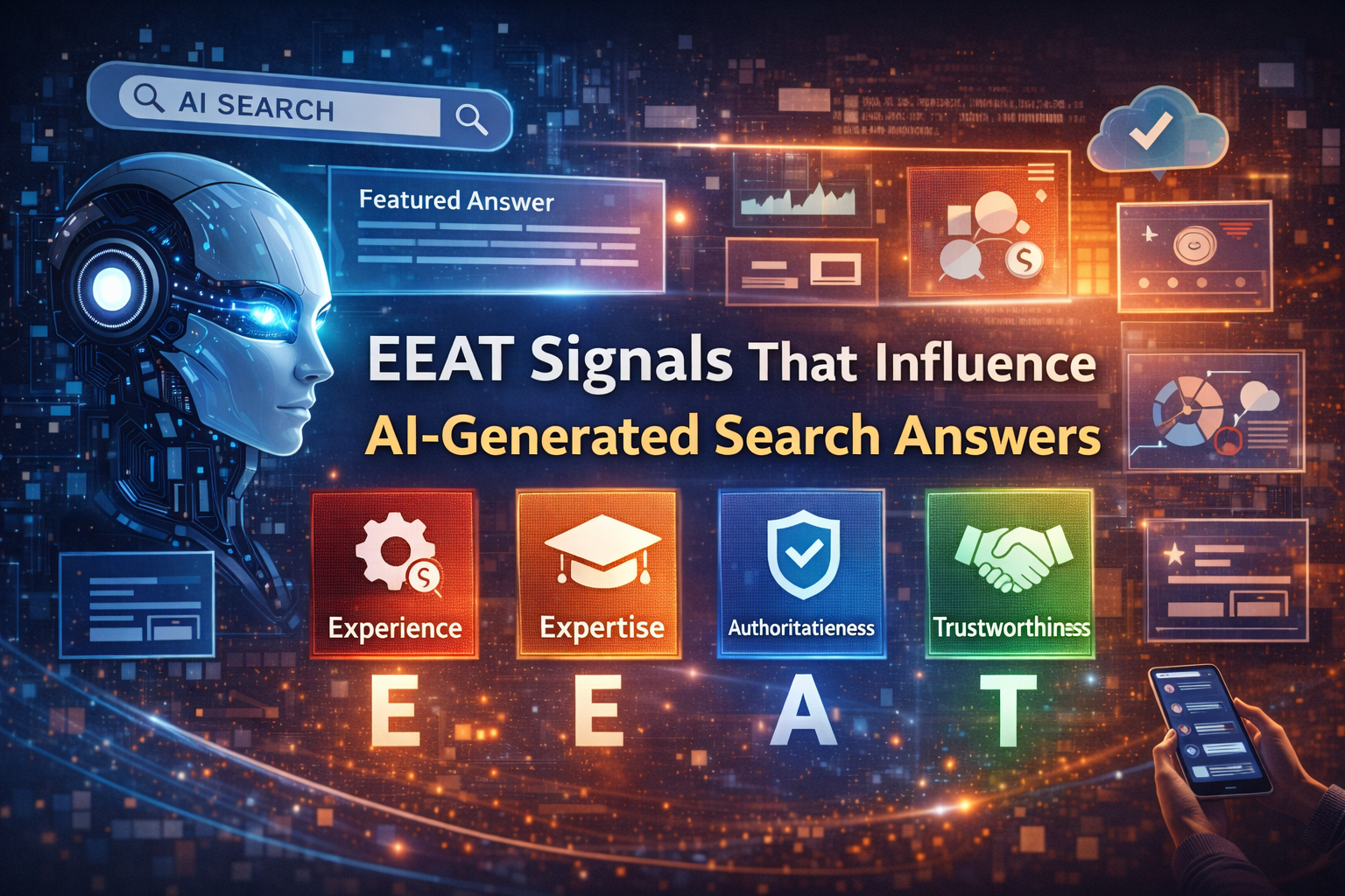
Understanding the Role of EEAT in AI Search: Artificial intelligence is revolutionizing how we search for information, with AI tools now delivering direct answers, summaries, and insights right on the search page. Gone are the days when users had to click through multiple links to gather relevant information. Instead, AI-powered search engines like Google's AI Overviews or ChatGPT now provide concise answers drawn from a variety of sources.